Logo Guidelines
Minnesota State University, Mankato’s logos are one of the most important expressions of the University’s brand. It’s critical that they are used correctly and consistently. Specific guidelines for each mark as included here, as well as when and where each is most appropriate.
Guidelines for All Logos
- Whenever possible, use the two-color logos. One-color and black-and-white versions are also available.
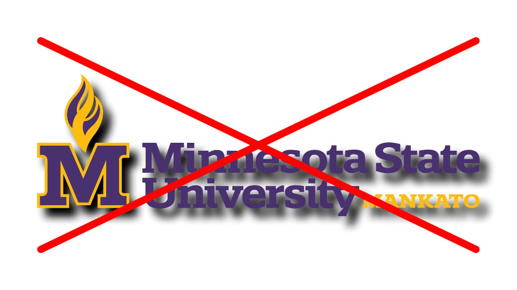
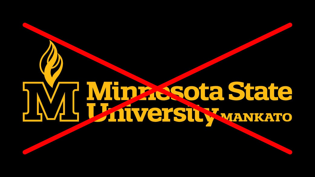
- The one-color gold logo cannot be used on a black background.
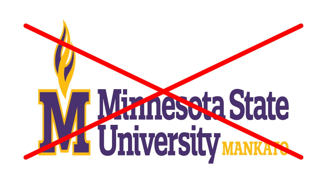
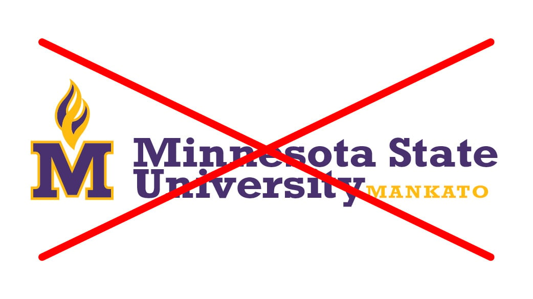
- No logo can be altered or modified in any way.
- Do not use screenshots or photos of logos.
- Maintain the required safe space around each logo.
- See samples of inappropriate usage below.
Jump to: Primary Logo, Stacked Logo, Wordmark Logo, Acronym Logo, Flame Logo, M-State Logo, Maverick Logo, System Logos
Primary Logo
The primary logo is the main visual representation of the university and should be used whenever possible.
Safe Space
The width of the M on the top of the logo; half the width of the M on the sides and bottom. 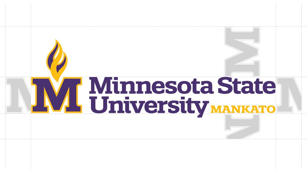
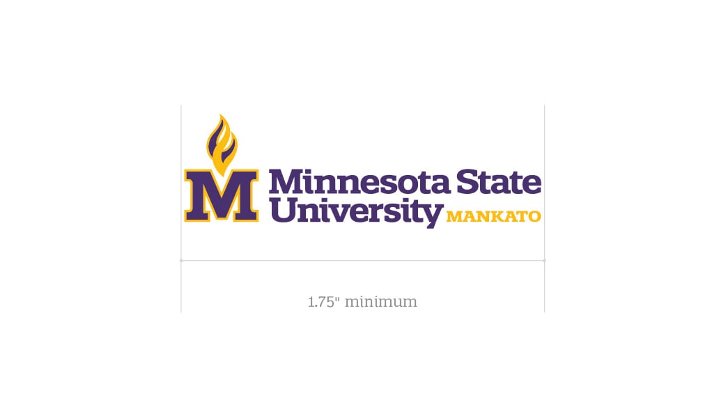
Minimum Size
1.75” minimum reproduction width.
Primary Logo Color Variations:
Available in two color (preferred), one color or black and white.








Primary Logo for Digital Primary Logo for Print
Stacked Logo
The stacked logo can be used as an alternative to the primary logo when space, size or design constraints exist.
Safe Space
The width of the M on the top of the logo; half the width of the M on the sides and bottom.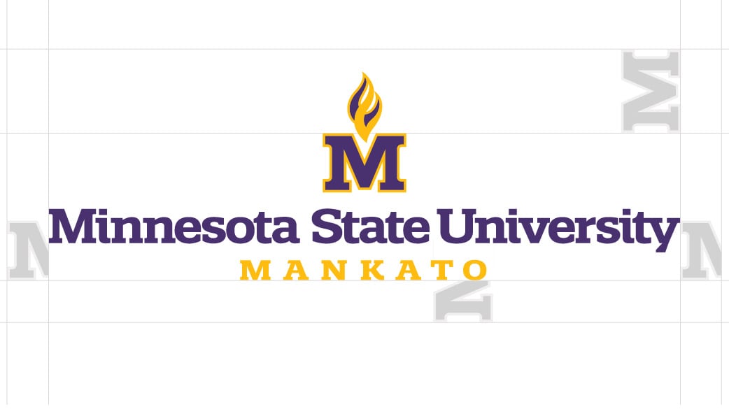
Minimum Size
1.5” minimum reproduction width.
Stacked Logo Color Variations:
Available in two color (preferred), one color or black and white.








Stacked Logo for digital Stacked Logo for Print
Wordmark Logo
The wordmark logo is an alternative to the primary and stacked logos. Its use should be limited to applications where there is limited printable space.
Safe Space
The width of the M on the top of the logo; half the width of the M on the sides and bottom. 
Minimum Size
1.5” minimum reproduction width.
Wordmark Color Variations:
Available in two color (preferred), one color or black and white.








Wordmark for Digital Wordmark for Print
Acronym Logo
The acronym logo should only be used when communicating with on-campus, alumni and local audiences. It must be accompanied by another university identifier that includes the full university name.
Safe Space
The width of the M on the top of the logo; half the width of the M on the sides and bottom. 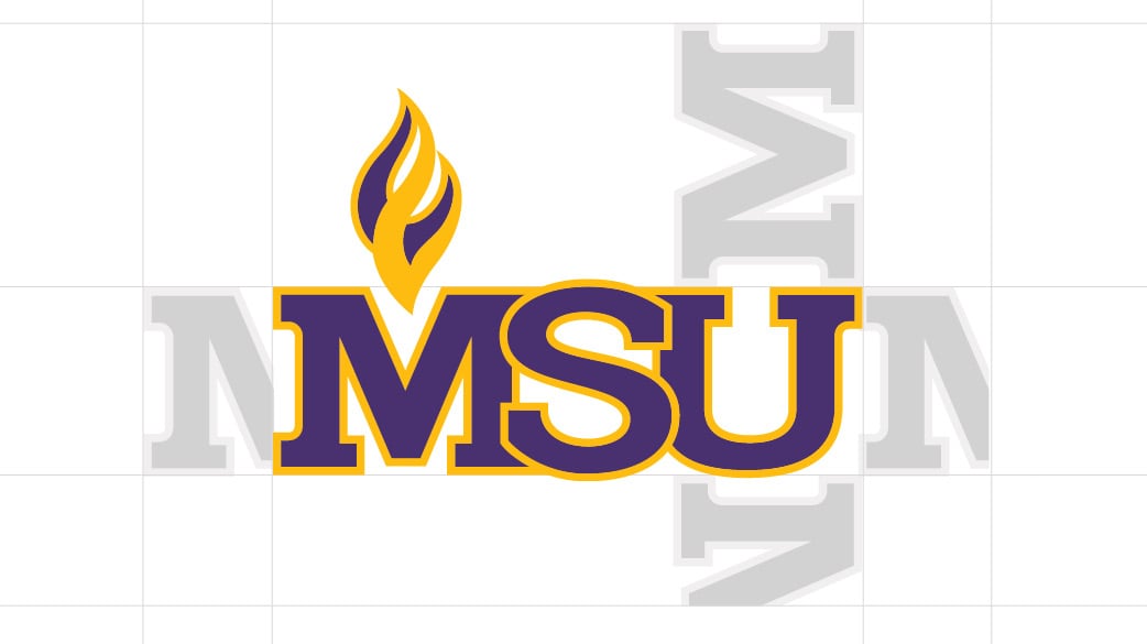
Minimum Size
.75” minimum reproduction width.
Acronym Color Variations:
Available in two color (preferred), one color or black and white.
Acronym Logos for Digital Acronym Logos for Print
Flame
The flame icon can be used as a versatile design element alongside other brand elements. It may only be used with approval.

University Icon
The University icon logo should only be used when communicating with on-campus, alumni, local audiences or with approval from University Marketing and Communications. It must be accompanied by another university identifier that includes the full university name. It may only be used with approval.

Maverick Icon Logo
The Maverick icon logo is an official Athletics logo. It may be used by non-Athletics groups with approval.
Request Usage through Athletics
Minnesota State System Affiliation Logos
Minnesota State University, Mankato is a member of the Minnesota State system. All print materials must include a system affiliation logo.
Inappropriate Logo Usage
Logo Distortion
Logo with Incorrect Typeface
Logo Shadowing
One Color Gold Logo on Black
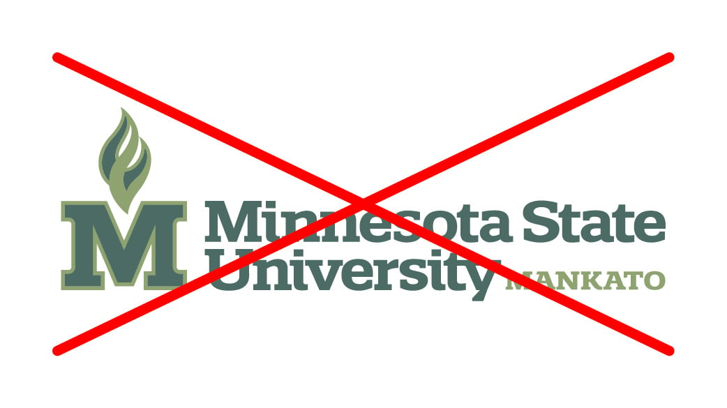
Logo Colorization
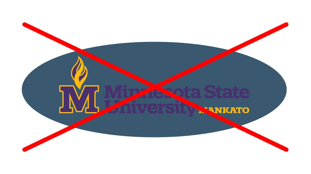
Logo in a Shape - Illegible Color Combo
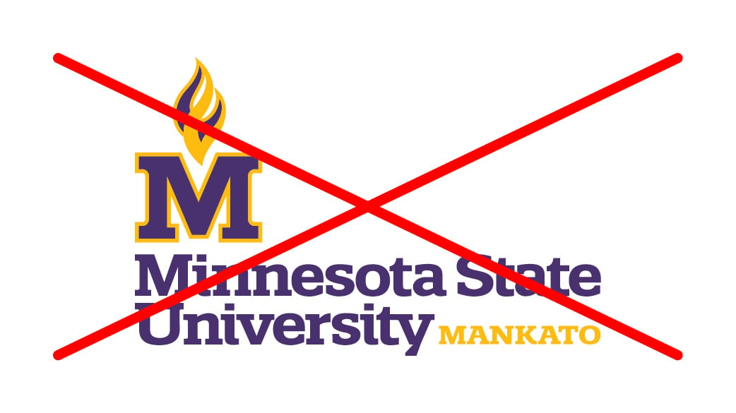
Logo Rearrangement
Logo Rotation
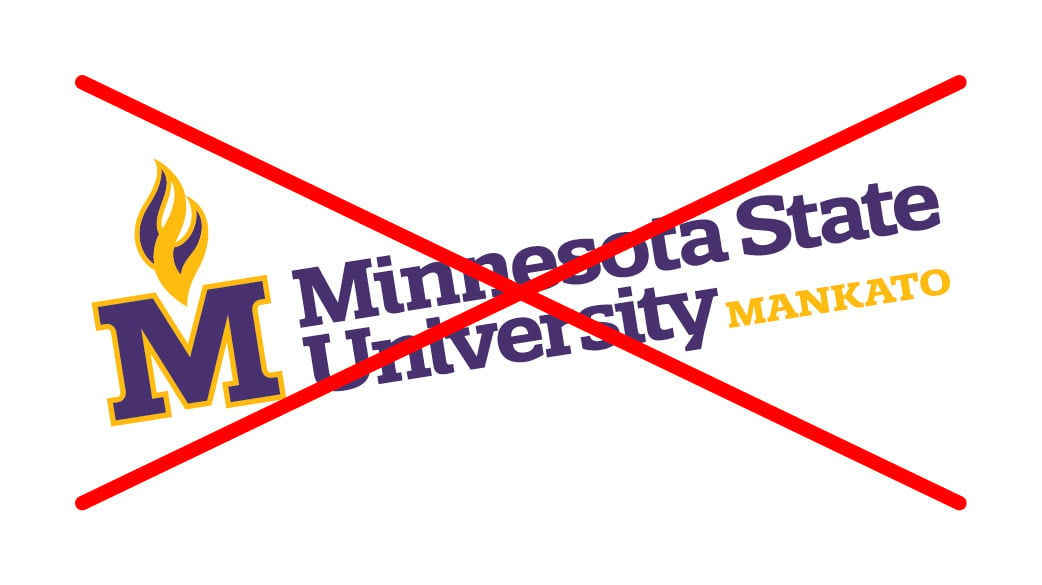
Logo over Distracting Background
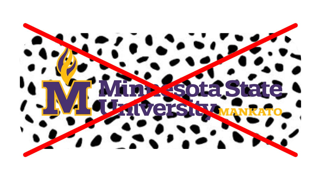
Logo Used as a Watermark
